Published Date : 2021年2月18日17:31
パート2: 給与所得者の所得税と住民税を計算するAndroidアプリ
Part 2: Android App Calculates Income and
Resident Taxes for Salaried Workers
This blog has an English translation
ニコニコ動画にアップした動画のまとめ記事です。
This is a summary blog post about a video I uploaded to NicoNico.
細かい部分は動画を参考にしてください。
Please refer to the video for details.
目次
Table of Contents
① 動画の説明
① Video
Description
警告:
今回説明する給与所得者の所得税及び住民税を計算するツールは、あくまで簡易的なお遊び用のツールです。
正確な数値、計算方法は各自で調べて下さい。
このツールは大雑把に大体の見積りを計算して楽しむ為のツールです。
決して従業員の年末調整や個人の確定申告等に使用しないでください。
さらに、税金の計算方法は変更される場合があり、控除についても同様です。
また、控除や税金の計算方法が間違っている可能性もありますので、
あまり信用せずに、各自で調べてから実験してみてください。
このツールを使って何かしらの損害が発生したとしても、私は一切の責任を負いません。
Warning:
The tool I'm going to show you for calculating income and residence taxes for salaried workers is just a simple tool for playing.
Please check the exact number and calculation method by yourself.
This tool is used to calculate rough estimates and enjoy them.
Do not use for year-end adjustment of employees or for individual tax return.
In addition, the method of calculating taxes and deductions may change.
Also, there is a possibility that the deduction and tax calculation methods are incorrect.
Don't trust it too much, and test it yourself.
I will not be liable for any damage caused by using this tool.
前回の続きです。
Continued from last time.
スクロールレイアウトの中にリニアレイアウトを配置します。
Places a linear layout in a scroll layout.
マージンは指定した数値の分だけ余白を作ります。
Margin creates a margin by the specified number.
リニアレイアウトのバックグラウンドの色を白に設定します。
Sets the background color of the linear layout to white.
リニアレイアウトのオリエンテイションを垂直に指定すると縦にビューを配置していくようになります。
Specifying a vertical orientation for the linear layout results in a vertical view orientation.
<LinearLayout
    android:layout_width="match_parent"
    android:layout_height="wrap_content"
    android:layout_margin="9dp"
    android:background="@color/white"
    android:orientation="vertical" >

</LinearLayout>
バックグラウンド等で使用されている独自の色のコードを[res]フォルダの中の[values]フォルダの中の[colors.xml]に書き込みましょう。
Write the code of your own color used in the background etc. in [colors.xml] file in [values] folder in [res] folder.
色を十六進数で指定して作成していきます。
Specify the color in hexadecimal values and create it.
色は各自の好みの色を設定してください。
Please choose your favorite color.
今回は暖色系の色を使っています。
This time I used warm colors.
ネット等でカラースキームを紹介しているサイトがあるので、そのようなサイトを参考にしてみてください。
There are websites that introduce color schemes on the Internet, so please refer to those websites.
最初のシャープの記号はその後に続く英数字の文字列が十六進数でRGBカラーを表現していることをコンピュータに知らせる為に必要です。
The first pound key is necessary to let the computer know that the following alphanumeric string represents an RGB color in hexadecimal.
因みに十六進数の「FF」を数値に直すと「255」になります。
By the way, if you convert the hexadecimal number [FF] to a number, it becomes [255].
つまり赤ならRGB表記で「255、0、0」となり、十六進数に直すと「FF0000」です。
That is, red is expressed as [255, 0, 0] in RGB notation, and this is expressed as hexadecimal number [FF0000].
「FFFF0000」の場合、ARGB表記になり、先頭の「FF」はアルファ値を表しています。
[FFFF0000] is in ARGB notation, with [FF] at the beginning representing the alpha value.
このアルファ値は値が小さくなるにつれて色の透明度が増します。
This alpha value increases the transparency of the color as the value decreases.
例えば背景は白色(#FFFFFFFF)の時、黒色(#FF000000)のアルファ値を下げていけば、背景の白が透けて見えてきて、黒色だったものが濃い灰色から薄い灰色に変化していきます。
For example, if the background is white (#FFFFFFFF) and you gradually decrease the black's alpha value (#FF000000), the white of the background shows through, and what was black changes from dark gray to light gray.
ではメインアクティビティへ戻り、リニアレイアウトの中にテキストビューを配置しましょう。
Let's return to the main activity and place the text view in a linear layout.
レイアウトグラビティをセンターにしてレイアウトの中央にテキストビューを揃えます。
Aligns the text view to the center of the layout with the layout gravity as the center.
マージンの属性値は各個人の好みで付けてください。
Set the margin attribute values according to your personal preference.
では、補足説明やボタンのテキストを[strings.xml]ファイル内に書いていきましょう。
Now, let's write supplementary explanation and button text in the [strings.xml] file.
<resources>
    <string name="app_name">My Application</string>
    <string name="supplementaryExplanation1"><u>月額給与における社会保険料の計算をする</u></string>
    <string name="supplementaryExplanation2"><u>月額給与(円)の範囲を選択してください</u></string>
    <string name="supplementaryExplanation3"><u>当てはまる年齢にチェックを入れてください</u></string>
    <string name="supplementaryExplanation4"><u>社会保険料と雇用保険(目安)の結果</u></string>
    <string name="iStextPlaceHolder">結果はここに表示されます</string>
    <string name="checkBoxText1">39歳以下</string>
    <string name="checkBoxText2">40歳以上</string>
    <string name="buttonText1">社会保険料の計算</string>
    <string name="startCalculatorBtnText">電卓を使う</string>
</resources>
左にあるプロパティタブをクリックすれば、コードを表示しているウィンドウを広く使えて、コードが見やすくなります。
If you click on the properties tab on the left, you can use the window displaying the code more widely, making the code easier to see.
戻す時はもう一度プロパティタブをクリックするだけです。
To revert, simply click the Properties tab again.
必要に応じて閉じたり、戻したりしましょう。
Click the Properties tab to close or open the Properties window as you needed.
文字にアンダーラインを引きたい時には[u]でラインを引きたい文字を囲ってやります。
To underline a character, use [u] to enclose the character you want to underline.
この[u]はアンダーラインの[u]です。
The [u] character is the [u] at the beginning of the underline character.
日本語で書いていますが、スペイン語や中国語、タイ語で書いてもちゃんと表示されます。
It is written in Japanese, but it is displayed properly even if it is written in Spanish, Chinese or Thai.
メインアクティビティへ戻るとネーム属性で指定された文字が表示されていることが確認できます。
When you return to the main activity, you can see that the characters specified in the name attribute are displayed.
プラスボタンを押せば拡大表示ができ、マイナスボタンを押せば縮小表示されます。
Press the plus button to enlarge the layout preview screen, and press the minus button to reduce it.
テキストサイズやボルド表示等も各自好みで調整してください。
Please adjust the text size and the bold display to your liking.
次にグリッドレイアウトをリニアレイアウト内に配置してレイアウトの一部分だけグリッド表示させます。
You then place the grid layout in a linear layout so that only a portion of the layout displays as a grid.You then place the grid layout in a linear layout so that only a portion of the layout displays as a grid.
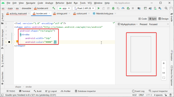
今度は[border.xml]ファイルを[res]フォルダ内の[drawable]フォルダ内に作成して外枠表示ができるようにします。
Now create a [border.xml] file in the [drawable] folder in the [resources] folder so that the border can be displayed in the layout.
シェイプ属性にレクトアングルを指定します。
Specifies a rectangle as the attribute value for the shape.
ストロークに線の太さや色を指定します。
Specifies a line weight or color for the stroke.
結果が右側に表示されているのですが、少し見づらいのでアンドロイドスタジオのカラーテーマを白系にしましょう。
The result is shown on the right, but it's a little hard to see, so let's change the color theme of the Android Studio to white system.
エディタ上部のファイルタブから、セッティングスを選択します。
Select Settings from the Files tab at the top of the editor.
テーマを[Darcula]から[IntelliJ Light]に変えます。
Change the theme from [Darcula] to [IntelliJ Light].
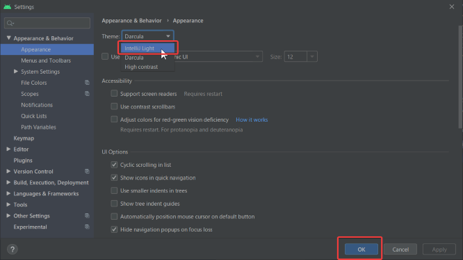
これで枠の線の表示が見やすくなりました。
The border lines are now easier to see.
後は必要や好みに応じて、パディングを設定したり、角に丸みを付けたりします。
You can then set padding or round corners to suit your needs and preferences.
ではメインアクティビティへ戻り、グリッドレイアウトのカラムの数を4列に、ロウの数を5行に設定します。
Then, returns to the main activity and sets the number of columns in the grid layout to 4 columns and the number of rows to 5 rows.
テキストビューを配置します。
Position the text view.
グリッドレイアウトのバックグランドに指定した外枠が確認できます。
You can see the outline specified for the grid layout background.
カラムスパンの数をグリッドレイアウトで指定したカラム数にして、レイアウトグラビティをセンターにすると、グリッドレイアウトの真ん中にテキストビューを配置することができます。
You can place the text view in the middle of the grid layout by setting the number of column spans to the number of columns specified in the grid layout and centering the layout gravity.
続いてユーザーが月額の給与の幅を選択できるようにスピナーを配置します。
You then position the spinner so that the user can choose the width of the monthly salary.
テキストアラインをセンターにして、スピナーの中に表示するテキストを中央揃えで表示させるようにします。
Center the text alignment so that the text displayed in the spinner is centered.
下のビューの補足説明用のテキストビューを配置します。
Place a descriptive text view for the view you want to place below.
40歳以上によって健康保険料が変わるので、年齢のチェックボックスを二つ配置します。
Since the health insurance fee changes when you are 40 years old or older, we will place two check boxes to choose your age.
チェックボックスにチェックが入った時に作動するメソッドをイベントリスナーに登録します。
Register a method in the event listener that will be invoked when the checkbox is checked.
社会保険料を計算させるボタンを配置します。
Place a button to calculate social insurance premiums.
ボタンが押された時にonClickイベントリスナーに登録したメソッドが起動して、社会保険料を計算して結果を表示させます。
When the button is pressed, the method registered in the onClick event listener is invoked to calculate the social insurance premium and display the result.
ではここまでの途中経過のアプリの挙動や表示等を確かめてみましょう。
Then, let's check the behavior and display of the application in the middle of the process.
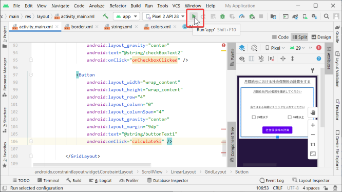
エミュレータをダウンロードしていない方はダウンロードするか、アンドロイド実機で確かめてみてください。
If you haven't downloaded the emulator, download it or check it with an actual Android phone.
エミュレータのダウンロード方法等は前の動画シリーズで紹介しているので参考にしてください。
Please refer to the video series above for details on downloading the emulator.
パート3へ続く。
Continue to Part 3.
以上です。お疲れ様です。
That's all. Thank you for your hard work.