Published Date : 2020年5月27日11:14
Part 3 - Djangoを使って簡単なオンラインショップを作ってみよう
Part 3 - Create a Simple Online Shop with Django
This blog has an English translation
YouTubeにアップした動画、「【Django】Part 3 - Create a Simple Online Shop with Django:Djangoを使って簡単なオンラインショップを作ってみよう」の補足説明の記事です。
Here's a little more about the 「【Django】Part 3 - Create a Simple Online Shop with Django:Djangoを使って簡単なオンラインショップを作ってみよう」 video I uploaded to YouTube.
Djangoを使って簡単なログイン機能を持ったオンラインショップのようなサイトを作ってみましょう。 Part3となる今回の動画シリーズでは、Bootstrapを使ってサイトの見た目整えていきます。
Use Django to create a site that looks like an online store with a simple login feature. In this video series, Part 3, we'll use Bootstrap to get our site looking good.
無駄な説明を省いて、忙しい時でも短時間で理解できるような動画です。
It's a video that can be understood in a short period of time even when you're busy, without any unnecessary explanation.
目次
Table of Contents
Bootstrapの準備をする Prepare Bootstrap |
テンプレートを使いサイトを分割する Split a site using a template |
ページの最後へ Go to the end of the page. |
Bootstrapの準備をする
Prepare Bootstrap
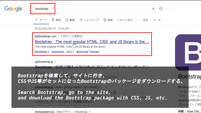
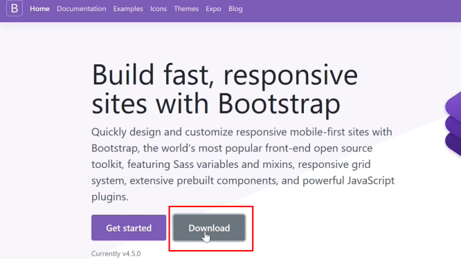
Bootstrapを検索して、サイトに行き、CSSやJS等がセットになったBootstrapのパッケージをダウンロードする。
Search Bootstrap, go to the site, and download the Bootstrap package with CSS, JS, etc.
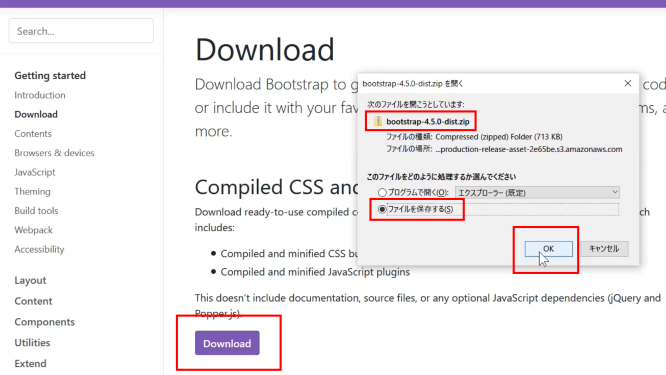
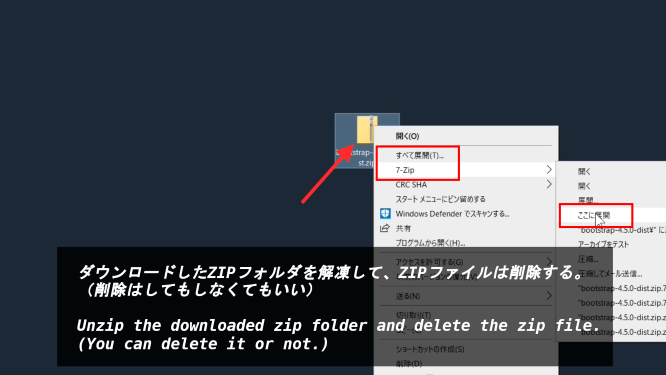
ダウンロードしたZIPフォルダを解凍して、ZIPファイルは削除する。(削除はしてもしなくてもいい)
Unzip the downloaded zip folder and delete the zip file. (You can delete it or not.)
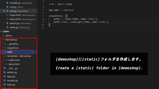
[demoshop]に[static]フォルダを作成します。
Create a [static] folder in [demoshop].
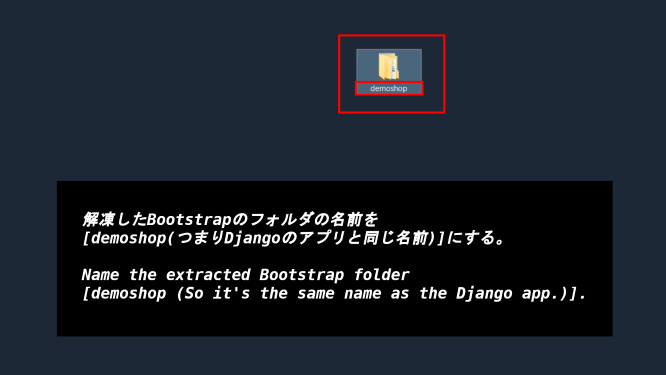
解凍したBootstrapのフォルダの名前を[demoshop(つまりDjangoのアプリと同じ名前)]にする。
Name the extracted Bootstrap folder [demoshop (So it's the same name as the Django app.)].
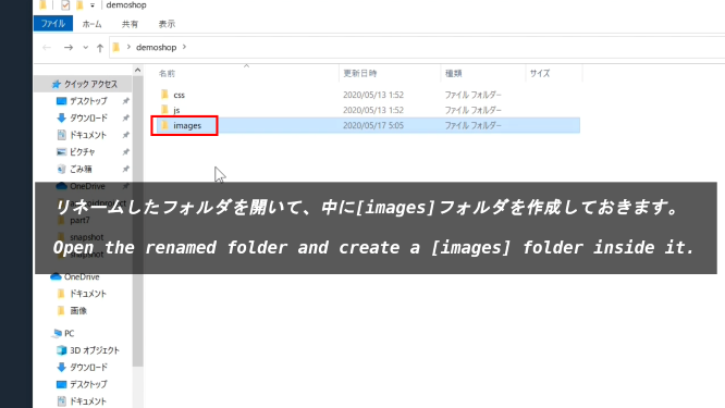
リネームしたフォルダを開いて、中に[images]フォルダを作成しておきます。
Open the renamed folder and create a [images] folder inside it.
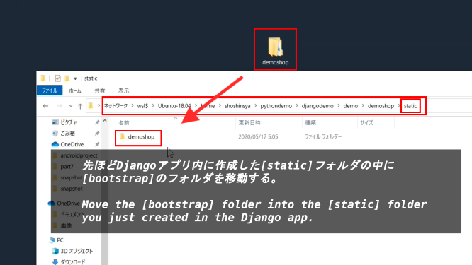
先ほどDjangoアプリ内に作成した[static]フォルダの中に[bootstrap]のフォルダを移動する。
Move the [bootstrap] folder into the [static] folder you just created in the Django app.
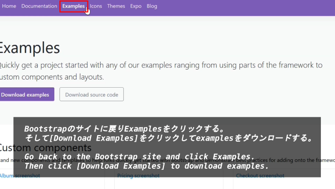
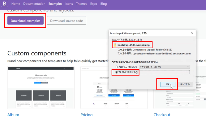
Bootstrapのサイトに戻りExamplesをクリックする。そして[Download Examples]をクリックしてexamplesをダウンロードする。
Go back to the Bootstrap site and click Examples. Then click [Download Examples] to download examples.
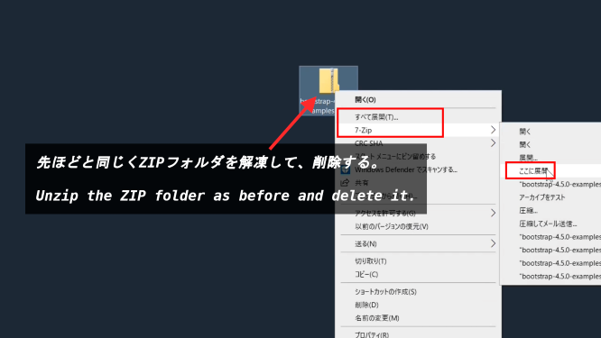
先ほどと同じくZIPフォルダを解凍して、削除する。
Unzip the ZIP folder as before and delete it.
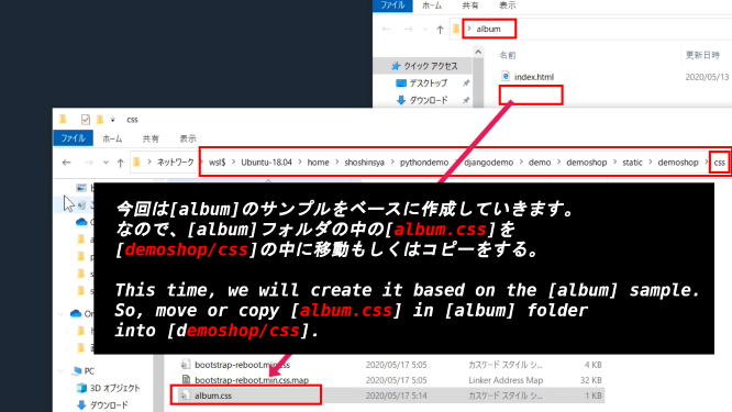
今回は[album]のサンプルをベースに作成していきます。なので、[album]フォルダの中の[album.css]を[demoshop/css]の中に移動もしくはコピーをする。
This time, we will create it based on the [album] sample. So, move or copy [album.css] in [album] folder into [demoshop/css].
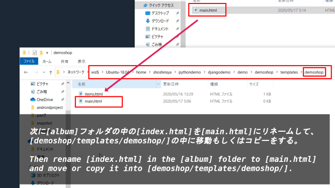
次に[album]フォルダの中の[index.html]を[main.html]にリネームして、[demoshop/templates/demoshop/]の中に移動もしくはコピーをする。
Then rename [index.html] in the [album] folder to [main.html] and move or copy it into [demoshop/templates/demoshop/].
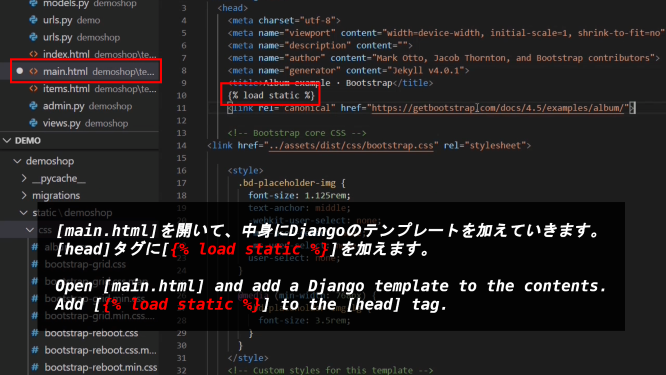
[main.html]を開いて、中身にDjangoのテンプレートを加えていきます。[head]タグに[load static]を加えます。
Open [main.html] and add a Django template to the contents. Add [load static] to the [head] tag.
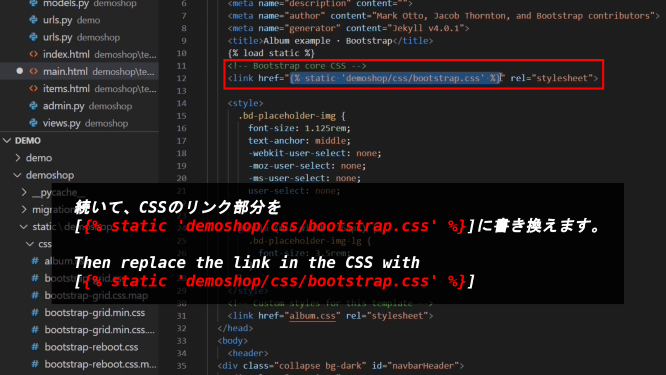
続いて、CSSのリンク部分を[static demoshop/css/bootstrap.css]に書き換えます。
Then replace the link in the CSS with [static demoshop/css/bootstrap.css]
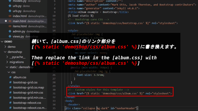
続いて、[album.css]のリンク部分を[static demoshop/css/album.css]に書き換えます。
Then replace the link in the [album.css] with [static demoshop/css/album.css]
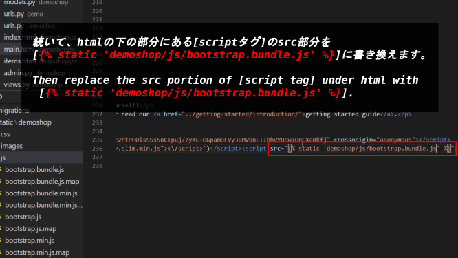
続いて、htmlの下の部分にある[scriptタグ]のsrc部分を[static demoshop/js/bootstrap.bundle.js]に書き換えます。
Then replace the src portion of [script tag] under html with [static demoshop/js/bootstrap.bundle.js].
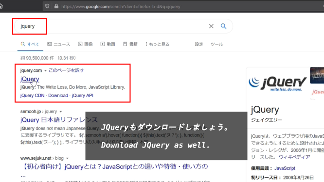
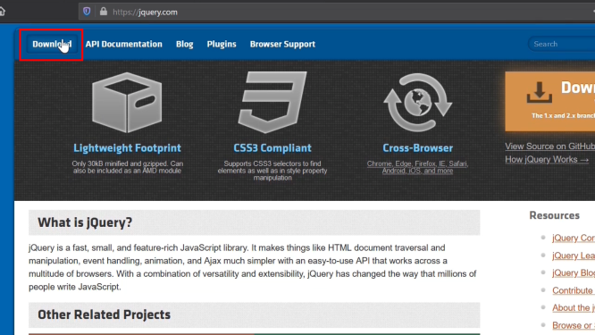
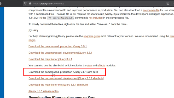
JQueryもダウンロードしましょう。
Download JQuery as well.
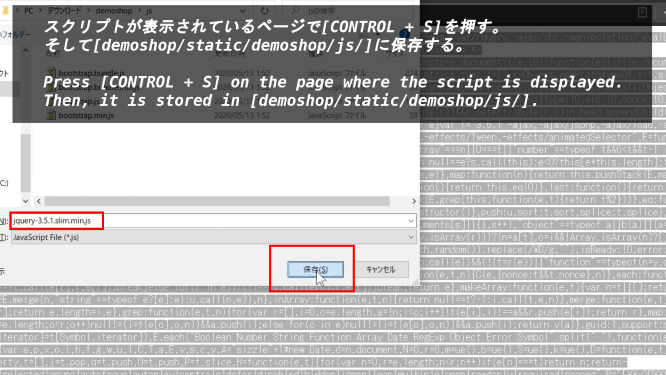
スクリプトが表示されているページで[CONTROL + S]を押す。そして[demoshop/static/demoshop/js/]に保存する。
Press [CONTROL + S] on the page where the script is displayed. Then, it is stored in [demoshop/static/demoshop/js/].
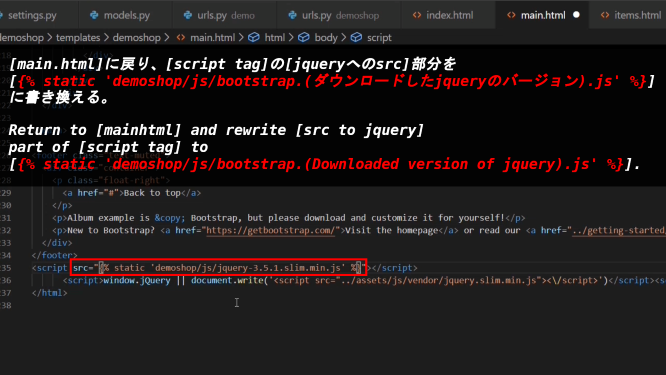
[main.html]に戻り、[script tag]の[jqueryへのsrc]部分を[static demoshop/js/bootstrap.(ダウンロードしたjqueryのバージョン).js]に書き換える。
Return to [mainhtml] and rewrite [src to jquery] part of [script tag] to [static demoshop/js/bootstrap.(Downloaded version of jquery).js].
テンプレートを使いサイトを分割する
Split a site using a template
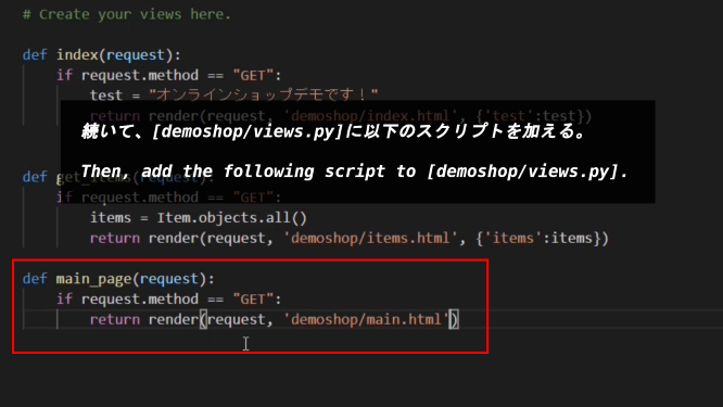
続いて、[demoshop/views.py]に以下のスクリプトを加える。
Then, add the following script to [demoshop/views.py].
def main_page(request):
    if request.method == 'GET':
        return render(request, 'demoshop/main.html')
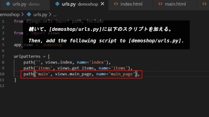
続いて、[demoshop/urls.py]に以下のスクリプトを加える。
Then, add the following script to [demoshop/urls.py].
urlspatterns = [
          .....................................,
          .....................................,
          path('main', views.main_page, name='main_page'),
]
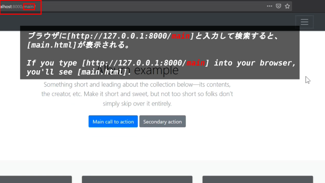
ブラウザーに[http://127.0.0.1:8000/main]と入力して検索すると、[main.html]が表示される。
If you type [http://127.0.0.1:8000/main] into your browser, you'll see [main.html].
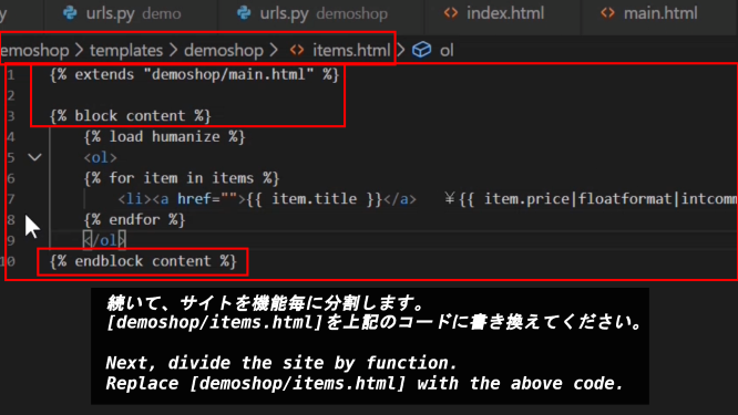
続いて、サイトを機能毎に分割します。[demoshop/items.html]を下記のコードに書き換えてください。
Next, divide the site by function. Replace [demoshop/items.html] with the following script.
{% extends "demoshop/main.html" %}

{% block content %}
    {% for item in items %}
    {% load humanize %}

    {% endfor %}
{% endblock content %}
補足説明:「extends」は[main.html]内から拡張されたコード部分であることを表しています。
Note: "extends" indicates an extended code portion from within [main.html].
つづく「block content」と「endblock content」で区切られた部分が「main.html」内に表示されます。
The part separated by "block content" and "endblock content" is displayed in [main.html].
後で画像で出てきますが、「main.html」内にこのコンテンツを表示するために、再度「block content」と「endblock content」を書く必要があります。
As you will see later in the image, you will need to write "block content" and "endblock content" again to display this content within [main.html].
このように表示部分を区切ることによって、例えばログイン画面に切り替える時にもサイトのベースとなる[main.html]を一度だけ書いてしまえば、「サイドバーやフッター等」をページ毎に用意する必要がなく、常に表示させておくこができるので便利です。
By separating the display parts in this way, for example, when you switch to the login screen, if you write the [main.html] that is the base of the site only once, you do not need to prepare the "Sidebar, footer, etc." for each page, and it is convenient that it is always displayed.
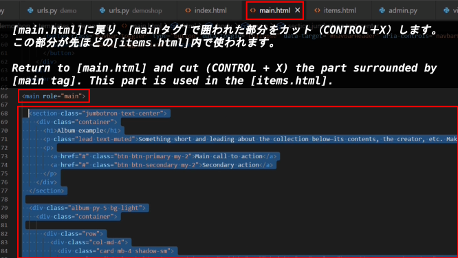
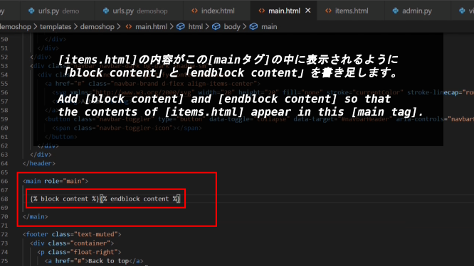
[main.html]に戻り、[mainタグ]で囲われた部分をカット(CONTROL+X)します。この部分が先ほどの[items.html]内で使われます。
Return to [main.html] and cut (CONTROL + X) the part surrounded by [main tag]. This part is used in the [items.html] above.
[items.html]の内容がこの[mainタグ]の中に表示されるように「block content」と「endblock content」を書き足します。
Add [block content] and [endblock content] so that the contents of [items.html] appear in this [main tag].
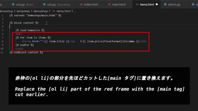
赤枠の[ol li]の部分を先ほどカットした[main タグ]に置き換えます。
Replace the [ol li] part of the red frame with the [main tag] cut earlier.
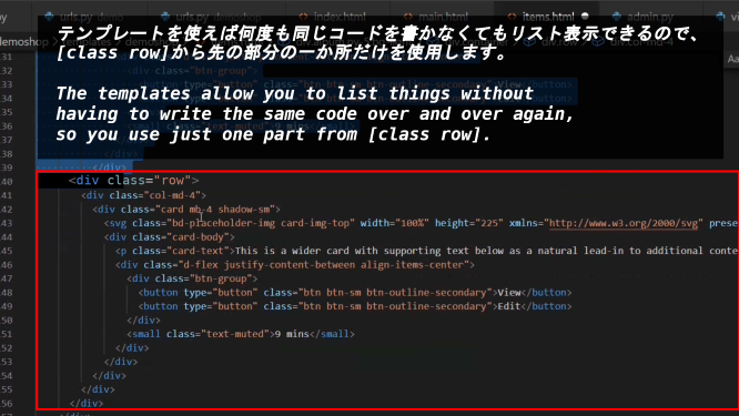
テンプレートを使えば何度も同じコードを書かなくてもリスト表示できるので、[class row]から先の部分の一か所だけを使用します。
The templates allow you to list things without having to write the same code over and over again, so you use just one part from [class row].
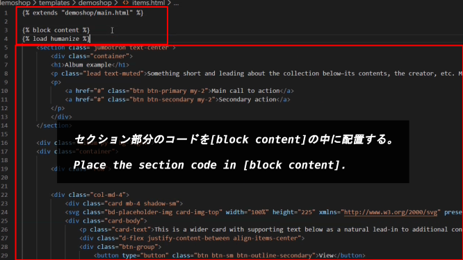
セクション部分のコードを[block content]の中に配置する。
Place the section code in [block content].
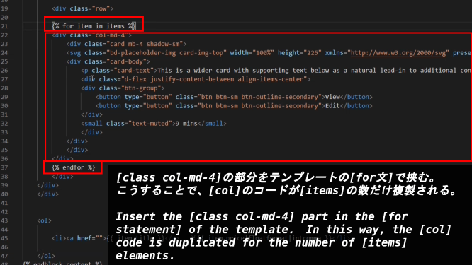
[class col-md-4]の部分をテンプレートの[for文]で挟む。こうすることで、[col]のコードが[items]の数だけ複製される。
Insert the [class col-md-4] part in the [for statement] of the template. In this way, the [col] code is duplicated for the number of [items] elements.
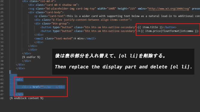
後は表示部分を入れ替えて、[ol li]を削除する。
Then replace the display part and delete [ol li].
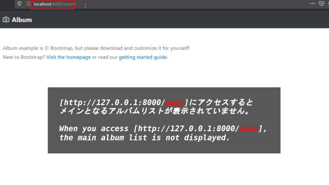
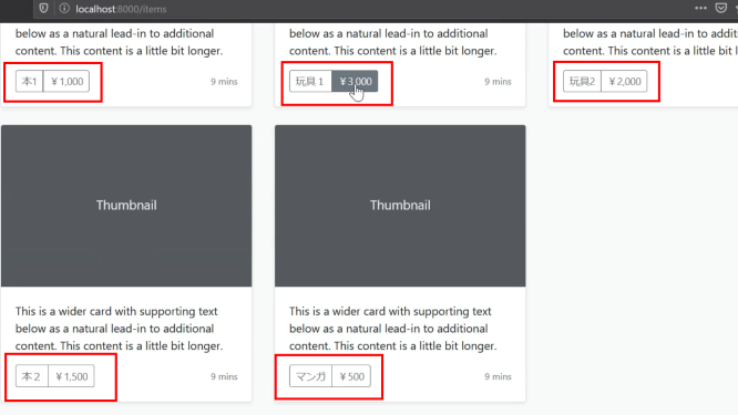
[http://127.0.0.1:8000/main]にアクセスするとメインとなるアルバムリストが表示されていません。
When you access [http://127.0.0.1:8000/main], the main album list is not displayed.
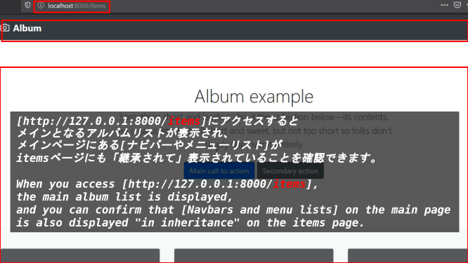
[http://127.0.0.1:8000/items]にアクセスするとメインとなるアルバムリストが表示され、メインページにある[ナビバーやメニューリスト]がitemsページにも「継承されて」表示されていることを確認できます。
When you access [http://127.0.0.1:8000/items], the main album list is displayed, and you can confirm that [Navbars and menu lists] on the main page is also displayed "in inheritance" on the items page.
このようにテンプレートを使用してサイトのページ表示を分割すると、メインとなるページのデザインを引き継いだり、機能毎に分けて管理したり、後から付け足したい、消したい場合等、様々な管理方法に対応できて便利です。
Using templates to divide the page display of a site in this way is convenient because it can handle a variety of management methods, such as inheriting the design of the main page, managing each function separately, And if you want to add or remove individual pages later.
以上です。お疲れ様です。次回はカスタマー用のモデルやログインページ等を作成していきましょう。
That's all. Thank you for your hard work. Next time, let's create a model, login page, etc. for the customer.